Freshily (2025)
Product Design
UI Design
Brand Identity
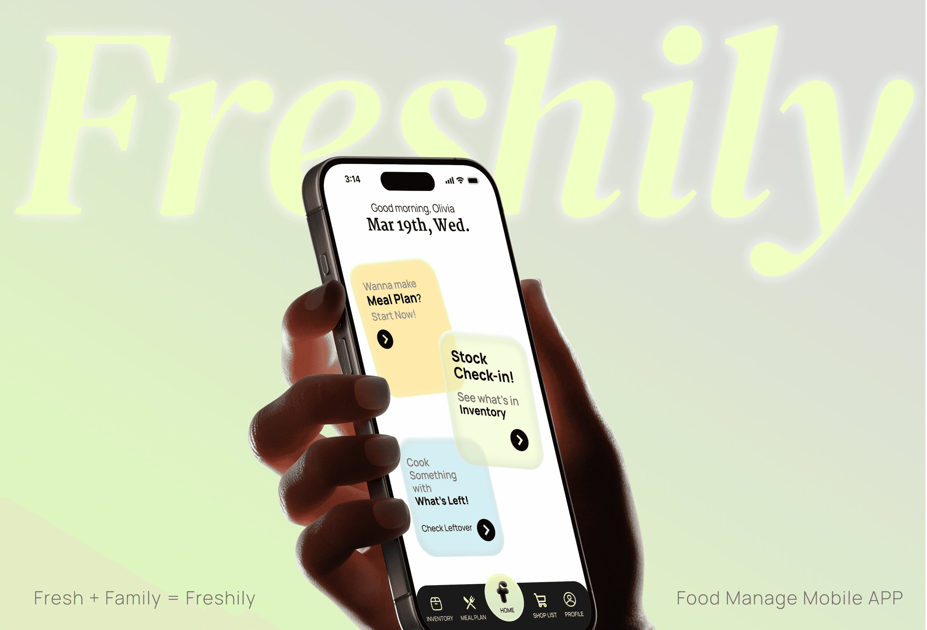
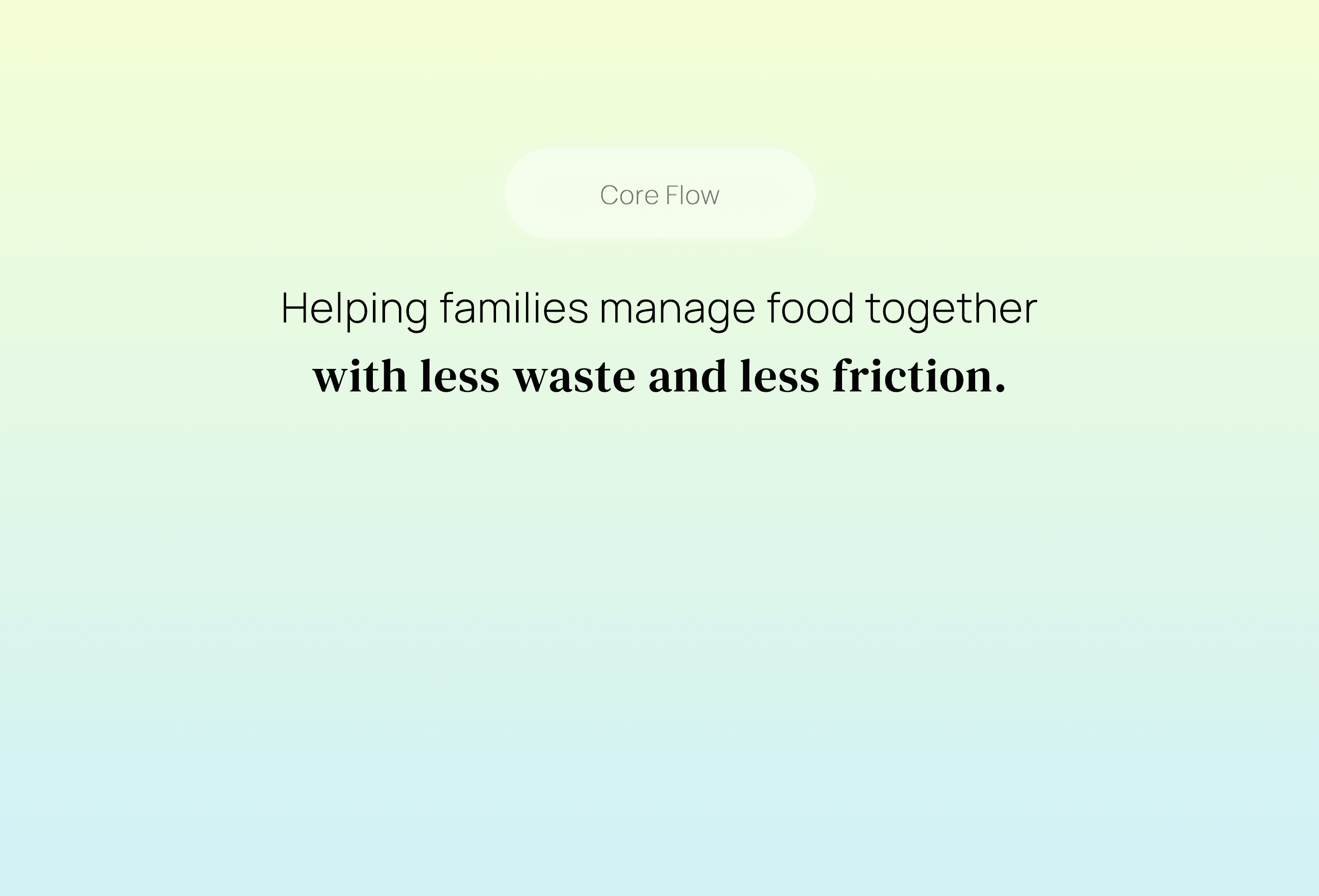
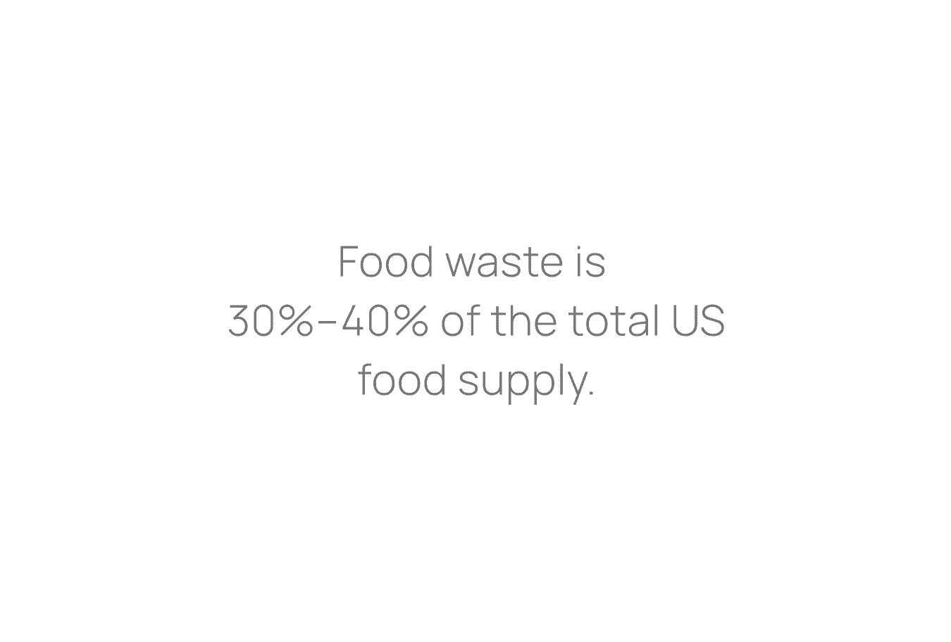
Freshily is a family centered food management system that supports households in managing inventory, planning meals, and coordinating shopping together.
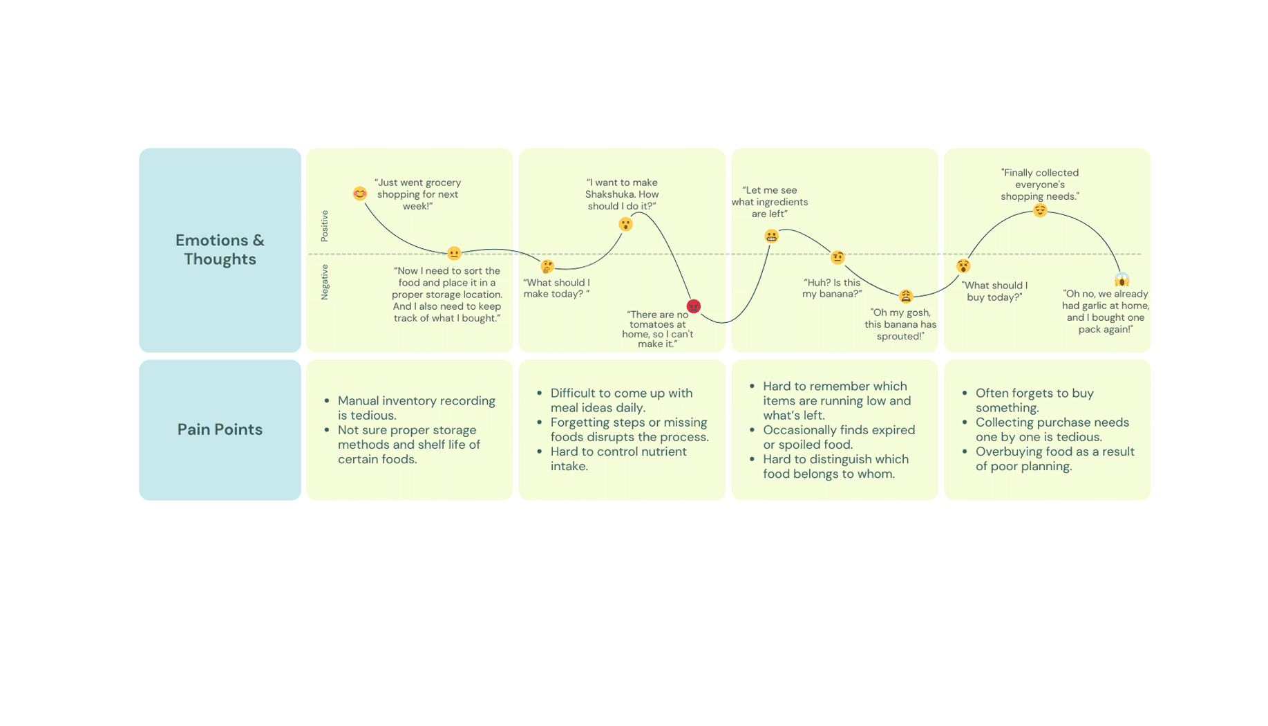
In this project, I focused on product and visual design, working closely with user research process to translate insights into a clear and usable system.
Auto-fill your purchases with friendly expiration reminders.
Solution 1


Don’t waste leftovers.
let AI take care of the rest.
Solution 2

Understand your household.
Plan around everyone’s needs.
Solution 3


Freshily is designed as a connected system that helps families coordinate food, reduce waste, and plan meals more intuitively.
Typography
Manrope
Manrope is a modern sans-serif designed for clarity and readability. The balanced structure keeps food data, lists, and actions easy to scan across the app.
30x
20x
12x
Logo Design
Using the “F” from Fresh as a base, the form evolves into an organic, planet-like shape, expressing care for everyday food habits.
Color Palette
Lime Green
#EEFFB8
The color palette uses fresh, natural tones to evoke balance, vitality, and a sense of care in everyday food management.
Mint Blue
#AFE8F1
Sesame Black
#686767
Avocado Green
#CFEEC0
Honey Yellow #FFE075